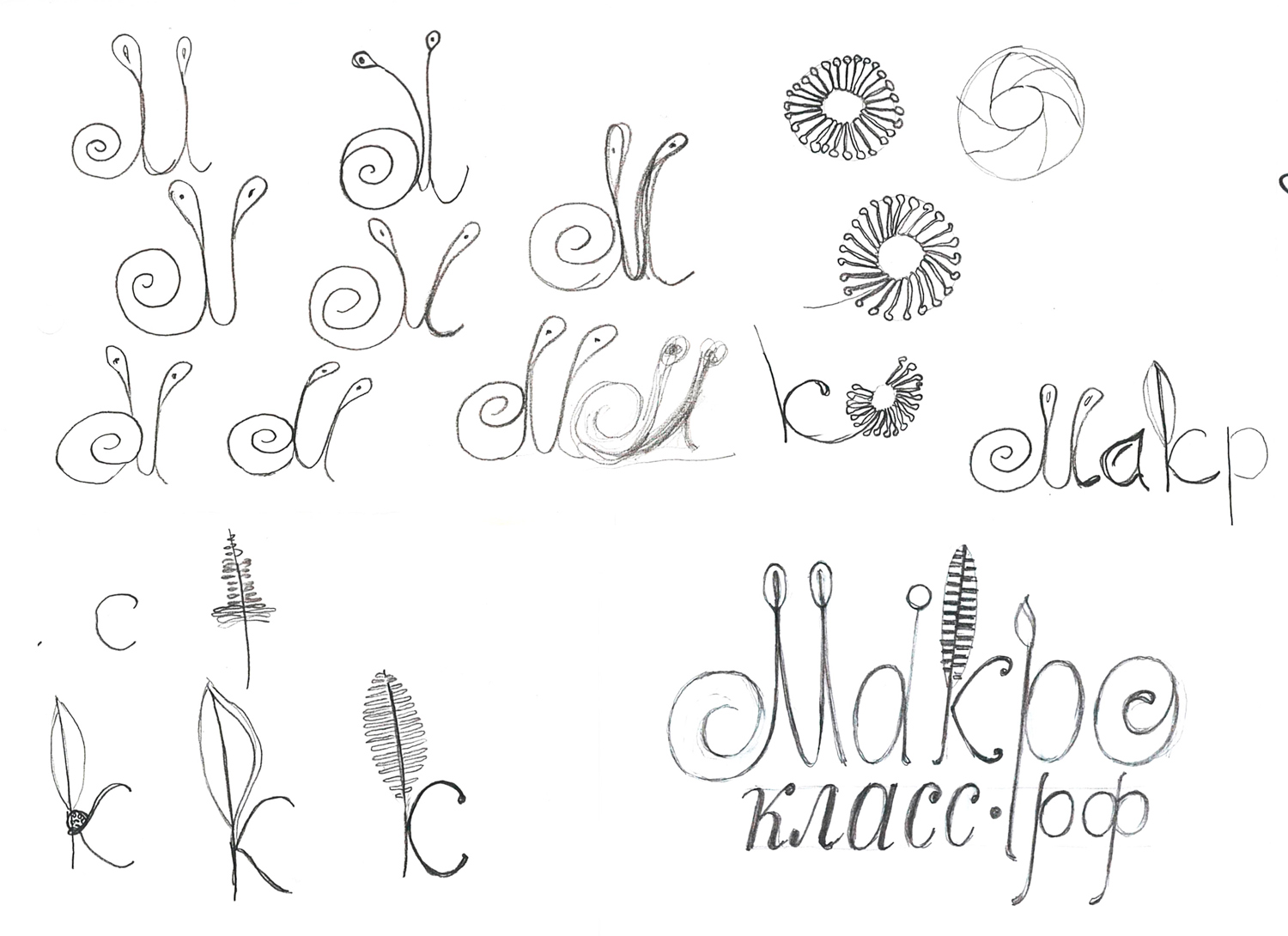
I came to an idea that letter elements of the logo should resemble different kinds of close up photography subjects – living creatures, and the logo as a whole to be of irregular shape or, better word, asymmetrical.
Letters of the word Macro (Russian equivalent: Макро) were drafted as: a snail, a dew droplet on a grass, a male beetle antenna, Polytrichum common moss spore holder, and a sundew leaf. Making the final draft, I’ve rejected sundew leaf for its complexity (hence, low scalability) and just put a general floral pattern. The word “class” (Russian equivalent: класс) is rendered in a school handwriting style, since our Macroclass workshops are both creative and educative.
